A picture is worth a thousand words & two pictures are worth…

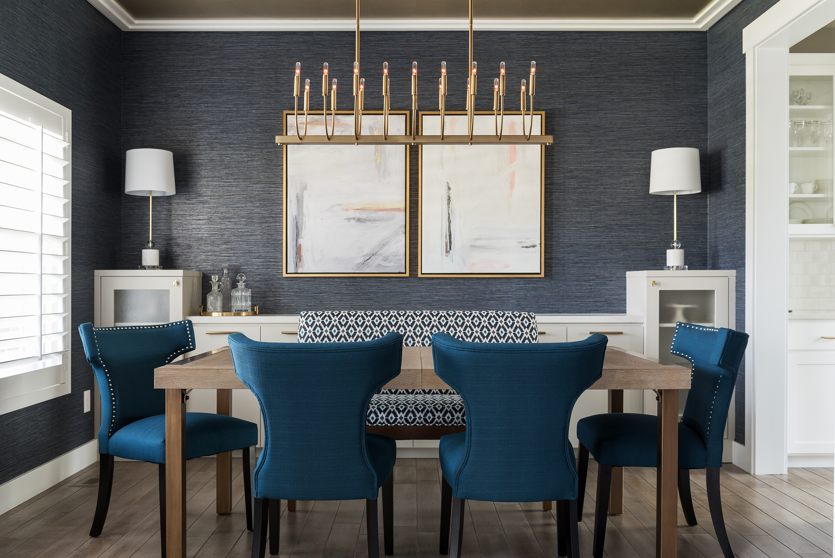
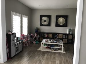
…Immediately deciding to reclaim the space that your kids have outgrown. These before and after photos should have you giddy about the prospect of updating a kids old playroom into a more functional space in your home. That is exactly what our clients decided to do.
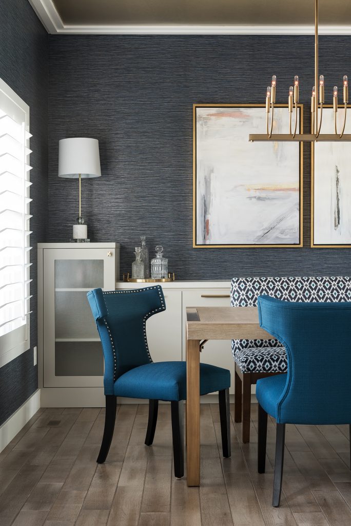
In addition to the added ceiling trim and gold paint, we used deep and dramatic shades of blue as the neutral base in the dining room. Navy is a versatile classic that can mingle with almost anything. Contrary to popular belief, cool dark colors like navy make a room look and feel larger. The dark wallpaper in our client’s dining room creates the illusion that the walls are receding or tapering away from the viewer, yet the striking gold ceiling keeps the room grounded and intimate, so it doesn’t feel too big. Don’t believe us…what is your go-to dress color for a night on the town? Black or another dark color, right? Why?- because it all comes back to the tapering away theory.

Unique features that seamlessly bring this space together:
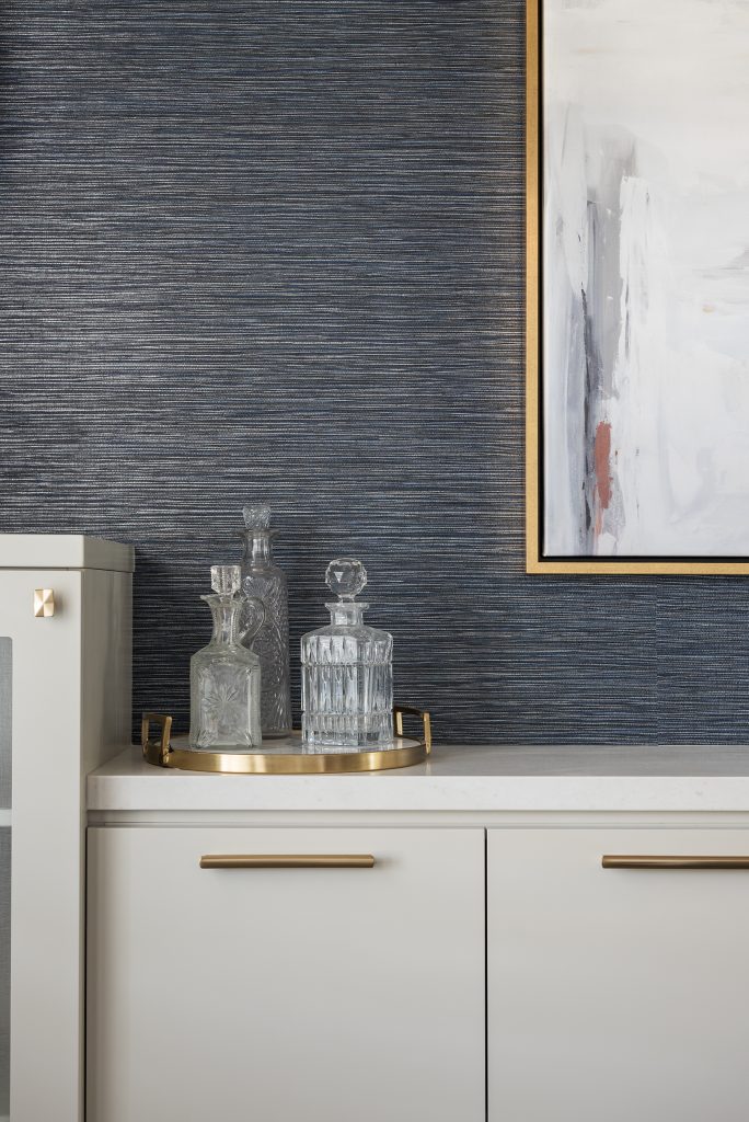
~Grandma’s bar set is pretty & meaningful
~The custom built-in wall-to-wall sideboard maximizes space (since we had limited depth to work with)
~The linear chandelier is a dramatic showstopper
~Last but not least, the artwork.

Don’t let this grown-up room fool you – it’s still kid-friendly. The “grasscloth” wallpaper is a durable, washable vinyl that only looks like grasscloth. And the custom dining bench easily accommodates an extra child, PLUS the fabric is actually bleachable!
Want to see their stunning master bedroom?
Up next: the jaw-dropping entryway and great room!

