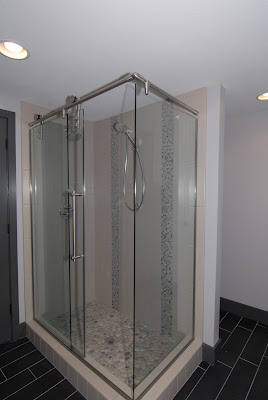
We are nearly finished with a great project that involved reconfiguring and refinishing a basement in order to give the clients a Master Suite, and I thought it would be fun to give a recap of the design & selections process we went through.
Moving walls, especially in a basement, can be a challenge, as these walls may be load-bearing, and they will likely contain plumbing lines, electrical wires, and HVAC ducts that feed the basement as well as the upstairs floor(s).
This basement we started with was likely an old DIY finishing project. (This was not the work of my clients – they bought the house this way!). It presented a lot of these structural and mechanical challenges, as mentioned above, along with some interesting and unexpected construction methods (as we often see with DIY projects) that made the demolition and prep phases even more challenging.
Old Plan:
The old configuration had 2 bathrooms (one of which was a very odd layout, as the bathroom was open to the adjacent den-type space, and the toilet was tucked beneath the stairs). The open room that the bathroom was in had no connection to the rooms in the back of the basement, except through the laundry room. This back space included a kitchenette, the other bathroom, and 2 small awkward rooms.
I worked with Drew & Mike of ReVive Remodeling to determine which walls we could move and how everything could be re-routed & relocated.
We left the laundry and mechanical rooms where they were, but reconfigured everything else to include:
- Den/Office
- Bedroom
- Bathroom
- Large Master Closet
New Plan:
The bathroom itself is a very unique layout. We didn’t have the luxury of space for a large bathroom with separate toilet room, so we created a niche for the toilet behind the shower. Not only does this give the clients privacy, but it also allowed the toilet to remain in the existing plumbing location, which saves money.
Selections:
I started with this (very sketchy) sketch to propose a look for bathroom sink wall.
The concept was based on the clients’ need for storage, their love of concrete and that “rustic modern” look, and their desire for 2 sinks (which they didn’t really have a lot of space for). Fortunately, the clients loved it, and so from there I worked with them to finalize finishes. Below is one collage photo and paint samples, and you can see more on this previous post.
- Mike from Future Form Designs for the custom concrete sink
- Bill & Jason at Hallmark Cabinets for the beautiful sink base
- Cora at Elume Distinctive Lighting for the vanity fixtures
- Kathleen at European Marble & Granite for the great deal on the limestone remnant pieces
- Jodi at Mountainland Design for the plumbing fixtures
- Also the other trades that Mike & Drew worked directly with on site…
I’m lucky to have been a part of this project!


Another cool contemporary project?! Wow, Utah is really coming around isn't it? Looks like it will be amazing!
It looks amazing Nicole!
Hi,
I have a quick question about your blog, do you think you could e-mail me?
Brian
What a great post. I’m emailing this to my friends.