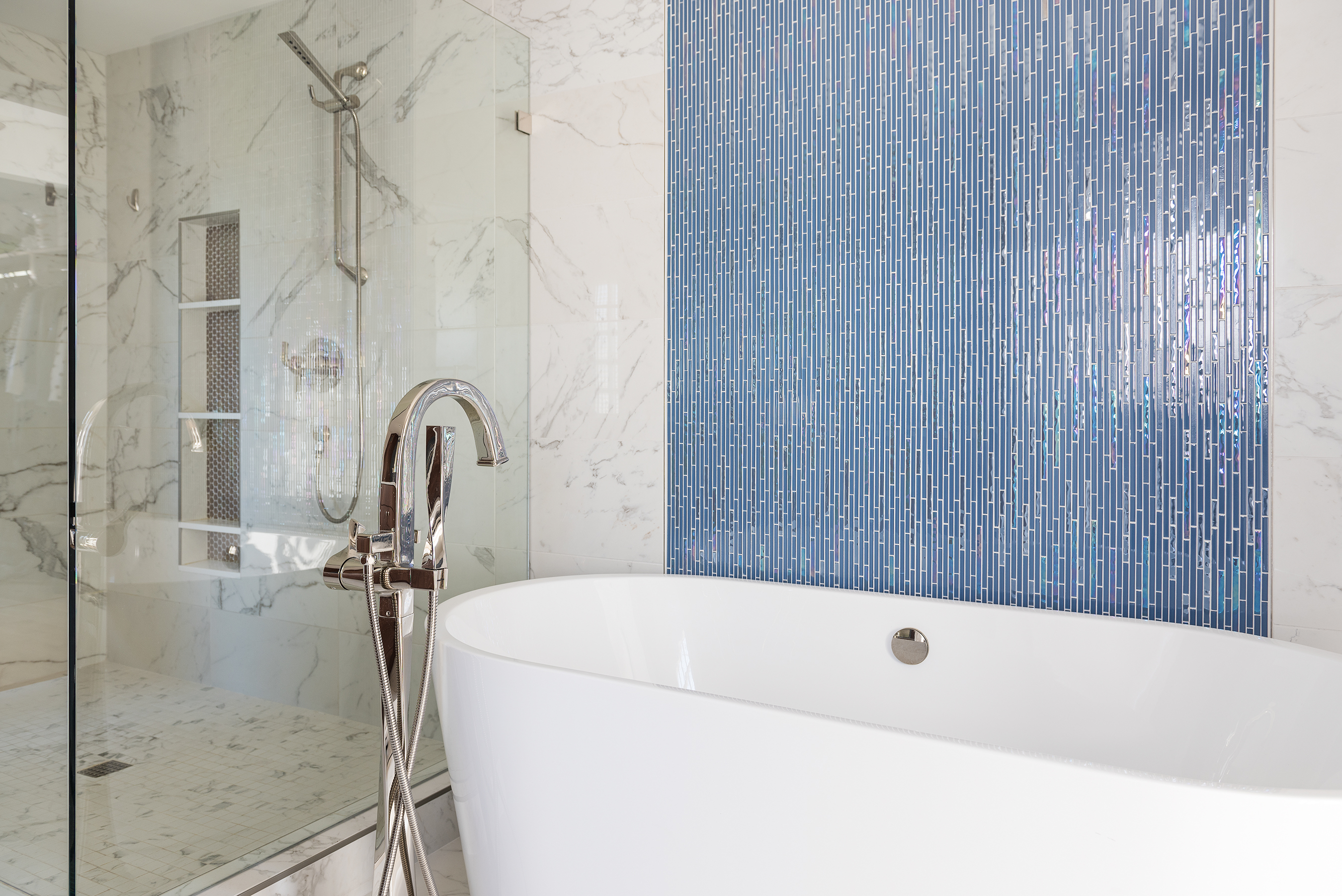
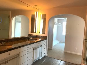
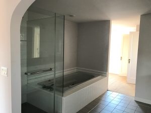
This before and after project is dramatic.
Simply stated, we moved a wall and a doorway. Let’s be honest, if you are not in the design business that first sentence might sound like an oxymoron because moving a wall is far from simple. However in doing so, we extended the tub & shower wall by 2.5′, which made all the difference. An important aspect we had to consider was that our client’s bed sits against the opposite side of this wall, and we had to ensure it was spacious enough for their king bed and headstands.
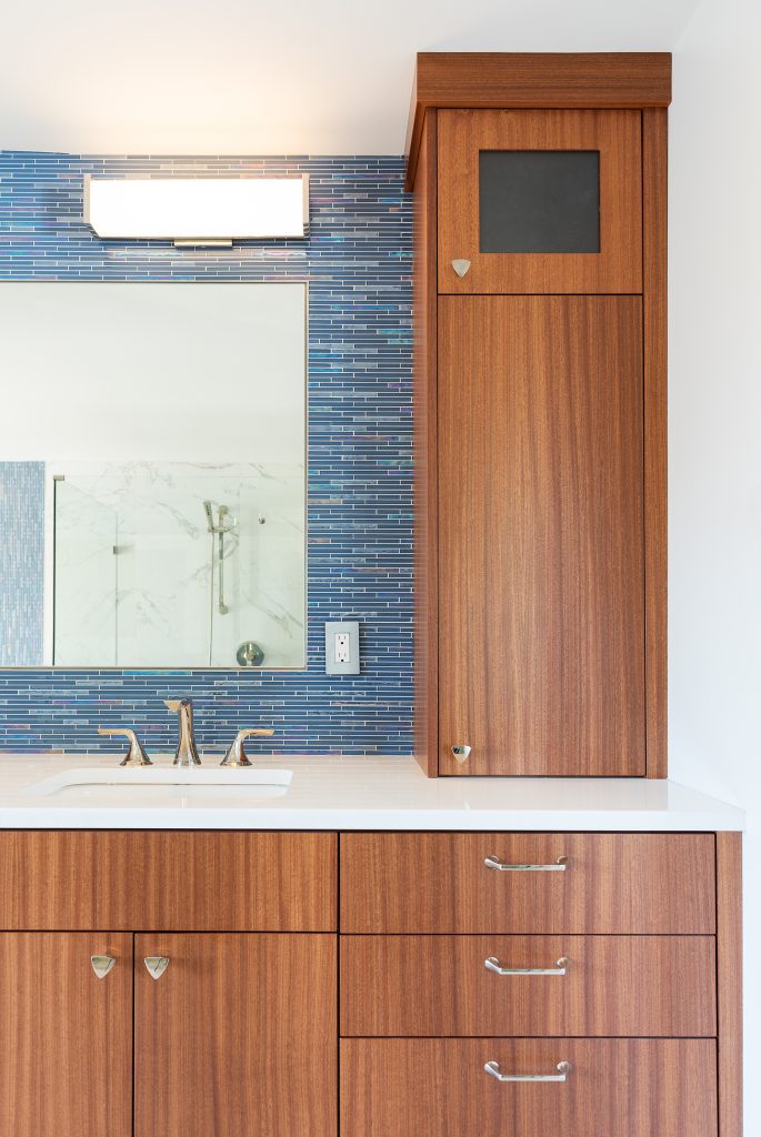
What We Love About the New Master Bath:
~The hint of art deco flair still present
~A little more flexibility that embraces modern technology
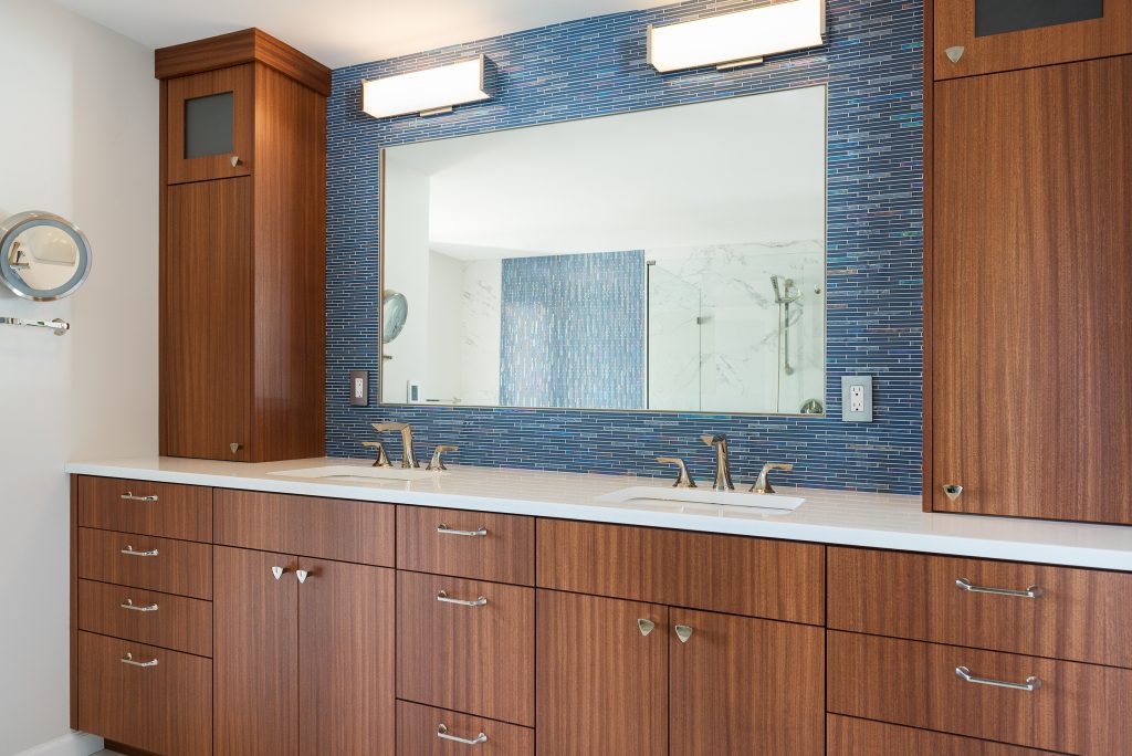
~The rich mahogany veneer that continues from the main floor kitchen into this space
~ A modern look of marble, but with the durability and low-maintenance of porcelain
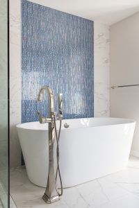
~ The linear glass tile which creates a spa-like waterfall feel while soaking in the sculptural freestanding tub
~Our signature vertical recessed 3-in-1 niche: a decorative element, plenty of shampoo/soap storage, and a shaving ledge.
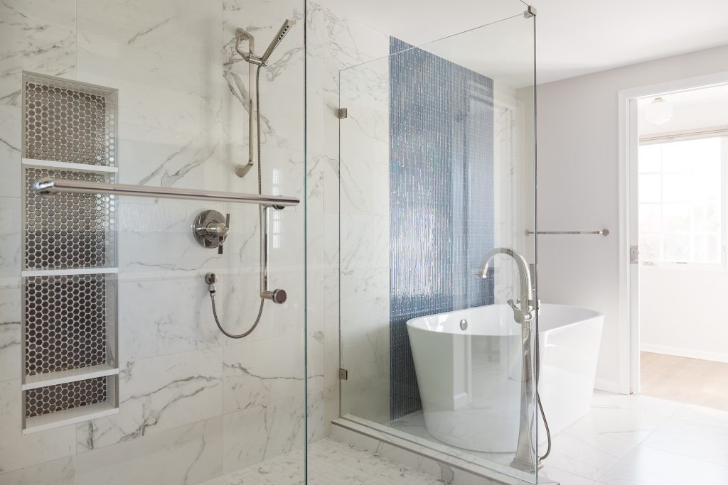
Each project we do is a giant team effort. A lot of thanks always go out to everyone involved in these beautiful projects. Gracias, merci, mahalo, & thank you to:

