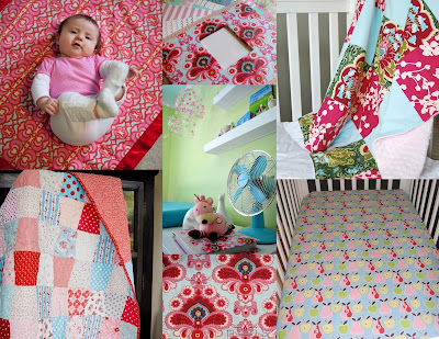
2. They’re moving a red bookcase into the room.
3. They don’t want too much pink.
4. They’re not into “the typical teddy bear borders and stuff like that”.
5. They want modern with a bit of traditional, to keep it comfortable.
6. They want to incorporate a music theme.
Collage info, clockwise from left to right (ending in center):
1. etsy baby blanket
2. from Young House Love
3. quilt from etsy
4. etsy apples & pears crib sheet (I believe this fabric is available at Jo-Ann Fabrics)
5. Amy Butler Fabric swatch (not sure what it’s called)
6. Bella Baby Quilt from etsy
Center: from Young House Love
This next collage puts together some miscellaneous concepts. When it comes to the music theme, I suggest keeping it relatively simple. Rather than wall decals, I might recommend using frames for album covers, music posters, sheet music, or a collage of concert ticket stubs. And I KNOW you guys have a great graphic designer in the family who could do something wonderful that’s music-related and worth framing, and will be much more meaningful. You could even just print out album covers in black and white and frame them in colorful frames. One of the images below also shows a vintage record player, which I think is a great touch.
Collage info, clockwise from left to right:
1. from Design-Crisis (album frame idea)
2. from Little Green Notebook (playful nursery design scheme with red)
3. nursery from 6th Street Design School (frame gallery wall, vintage record player)
4. source unknown (album wall)
5. from Sprout Gallery (crisp and fun red, blue, green color scheme with white backdrop)


I love all the options, but I really like red and pink together…with light green- perfect!
Makes me want to have a kid. OK, not really, but the idea of a nursery is fun. 🙂
Nicole, you are fantastic. Purely fantastic!
I wanna take from the first and the 3rd 🙂
What a beautiful collection!
Do you know of the correct light blue paint color used by top art galleries? It seems like a pale sky blue?