There’s a saying: “Don’t mix business with pleasure.” But I disagree. As long as you stay professional and set expectations in advance, it can be a very positive experience. Case in point: These clients are good friends of mine. Because of this, I’ve gotten to see them REALLY use and enjoy their kitchen, and I’ve experienced first-hand the impact it has on their family and their everyday life. Also, since we are friends and have some similar tastes, it was extra fun to work with them!
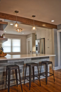
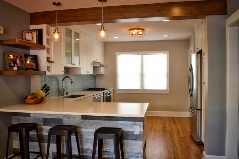
We removed a wall, shifted the layout, and upgraded everything. What a difference!
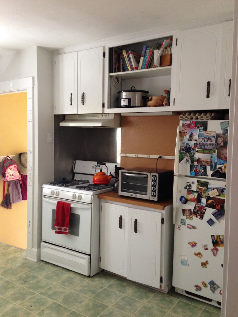
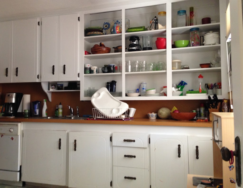
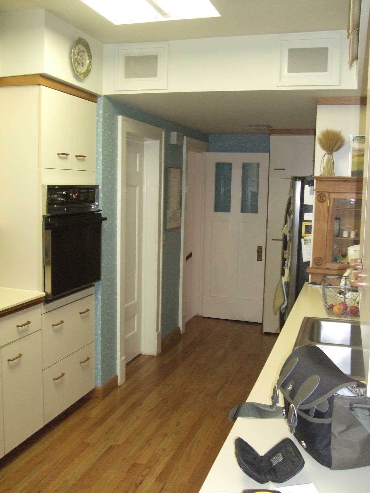
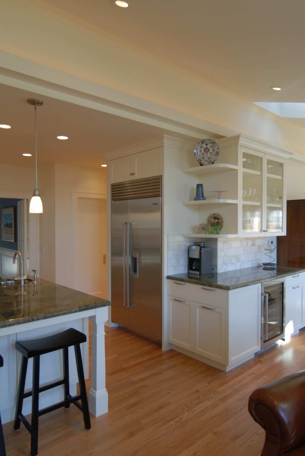
And to really truly show the transformation, here are some before photos:
]]>

Last week I wrote about a recent kitchen remodel over on the Utah Style blog. Today I wanted to present some before & after photos for comparison.
The “before” photos of a remodeling project are what makes remodeling so unique compared to new construction. They indicate the challenges involved in the job, as well as the dramatic difference good design can make, both in aesthetic and (just as important) function.
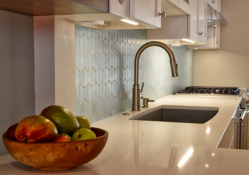
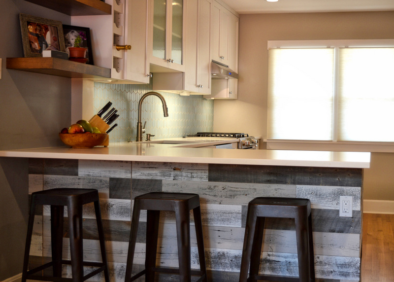
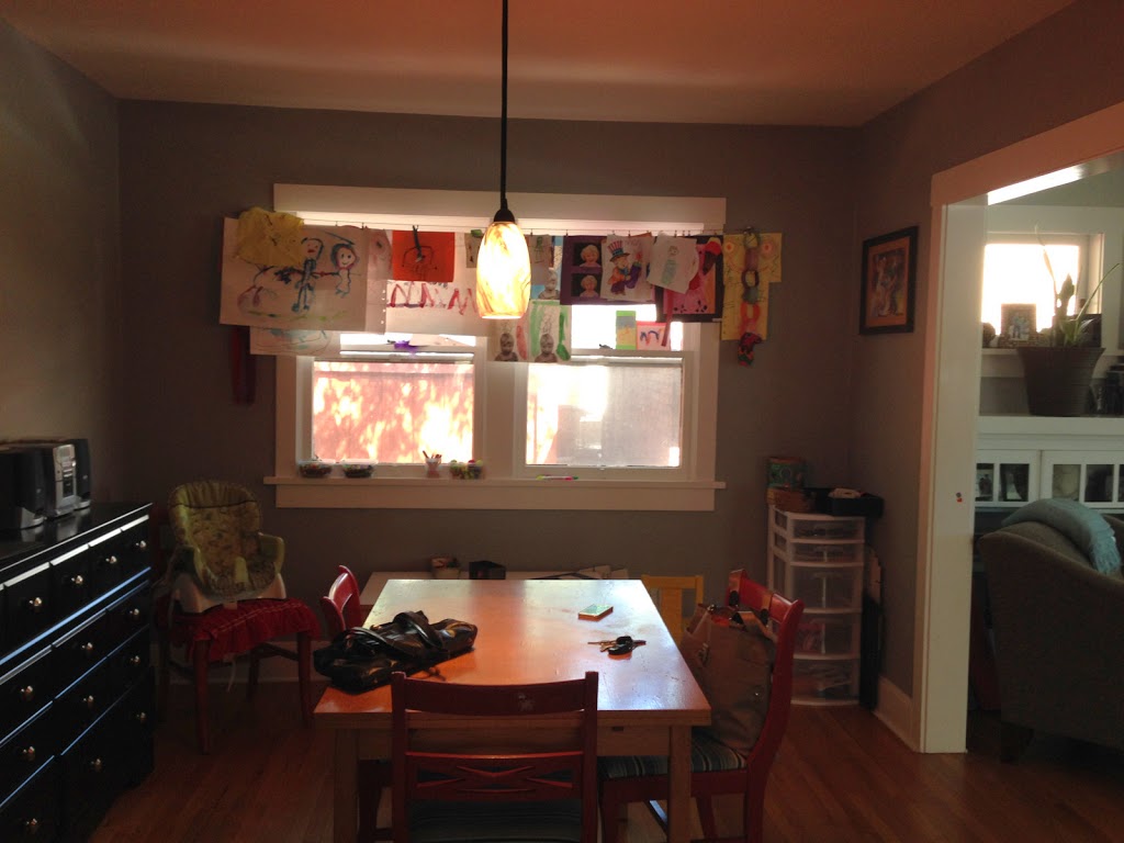
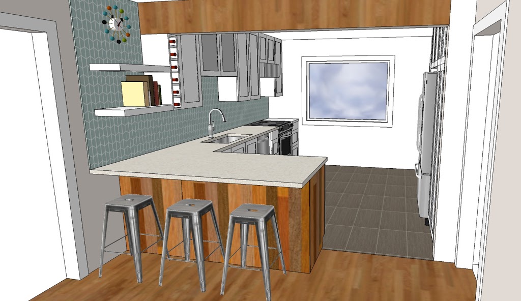
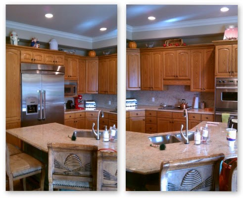
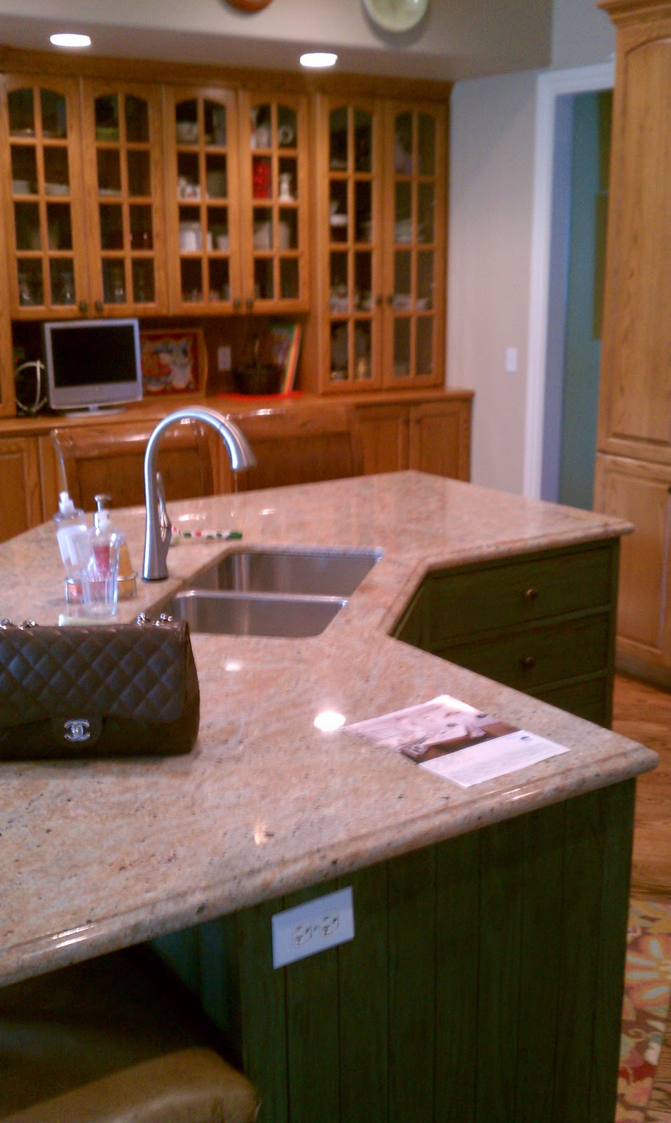
Let me give a little background on this project. The client was looking to update their oak kitchen so she called enzy design. During the course of our initial consultation I pointed out some of the inefficiencies of the kitchen layout, and we discussed potential changes. We explored these changes throughout the design phase – I presented a concept that combined the island and dining table, creating space for a casual sitting area in the kitchen. Fortunately the client was open to new ideas, and we went in this direction. Since photos speak louder than words, I’ll stop writing and just post some photos:
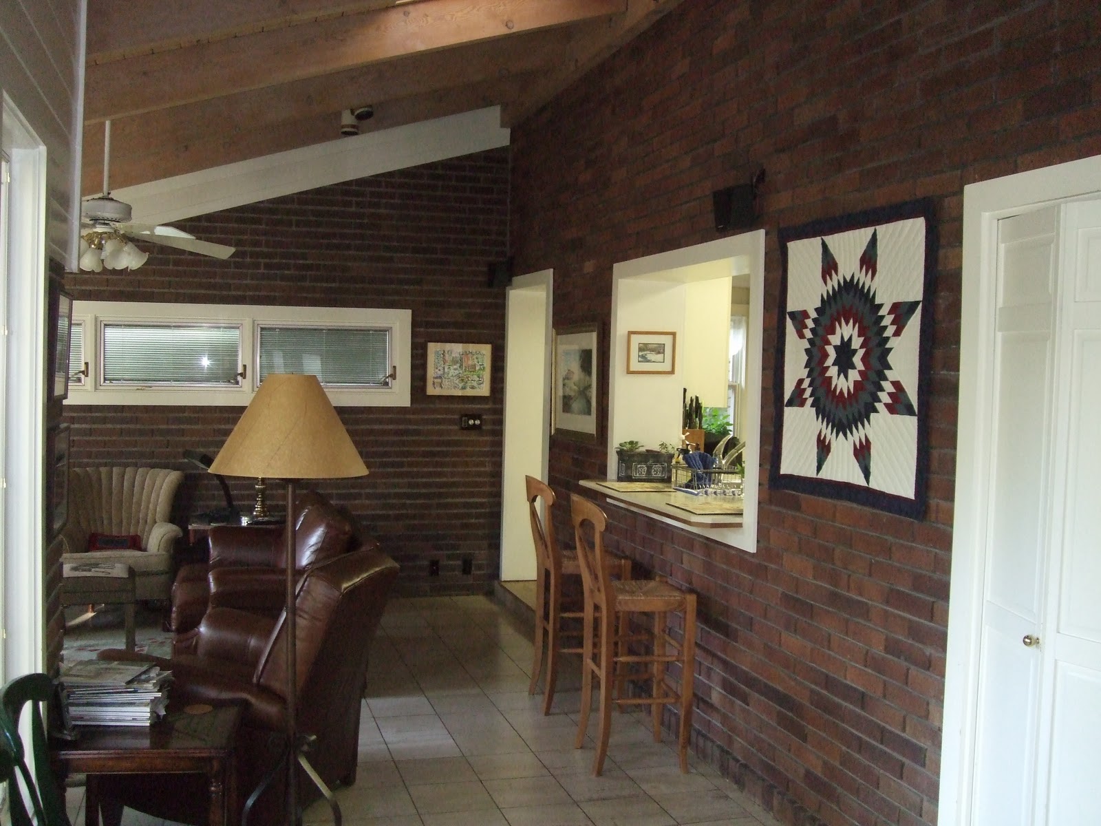
Before:
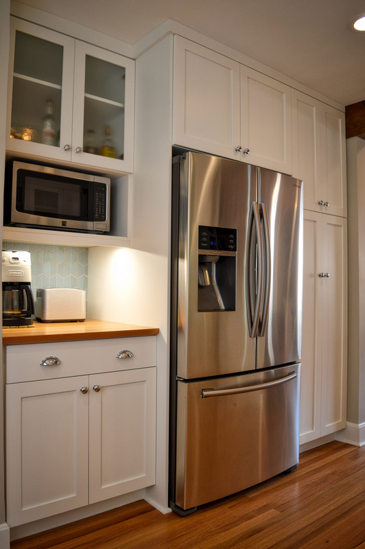
After:


While browsing around facebook over my morning cup of coffee, I stumbled upon this kitchen, newly installed in a showroom in Ireland. The showroom is O’Conners of Drumleck, and I’m now a fan.
I just had to share a couple of the images, and I think you’ll see why I had to post:


I’m giggling to myself about this title because I used to work at a tiny little kitchen design studio for about a year during college – I had forgotten about it until I decided to do a post about brass hardware in kitchens, as this place was called Kitchens & Brass. So, in homage to that short time in that little studio, I’ve titled this post “Kitchens & Brass.”
Anyway, it’s taken me a while to warm up to the resurgence of brass, but now that I’ve seen it in modern settings, I’m loving it. Brass is back, but in a VERY different way… with subtler tones and sleek modern lines. I stumbled across the above photo while flipping through my dwell magazine the other day, I can’t get enough of it. Brass with white and natural wood… the brass warms up this kitchen in a way that polished chrome or stainless steel couldn’t do. And it adds a little touch of formality, but in a non-stuffy way.
A few more examples of brass in modern(ish) kitchens:


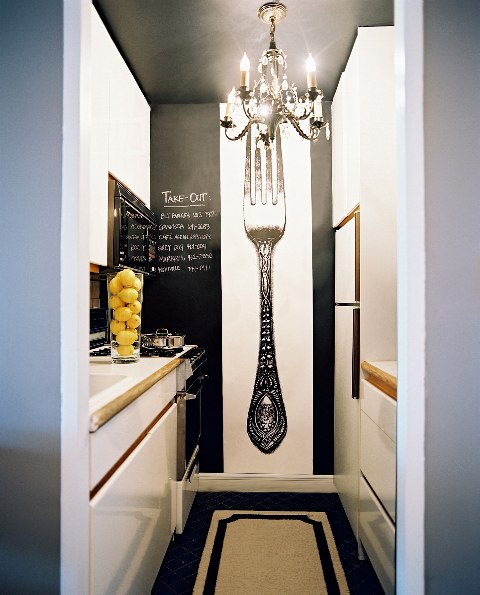
Check out this kitchen from Lonnymag. If you strip it down, you’re basically looking at a boring and outdated 80’s style white kitchen with laminate countertops and ugly old appliances. Oh, and don’t forget the honey oak accent strips! Looks like many of the galley condo and apartment kitchens I saw when I lived in DC.
Back when I lived in Washington DC, while working at Case Design / Remodeling, I had the chance to work with a wonderful client on what turned into a whole-house remodel. To this day, their kitchen is still one of my favorite projects.
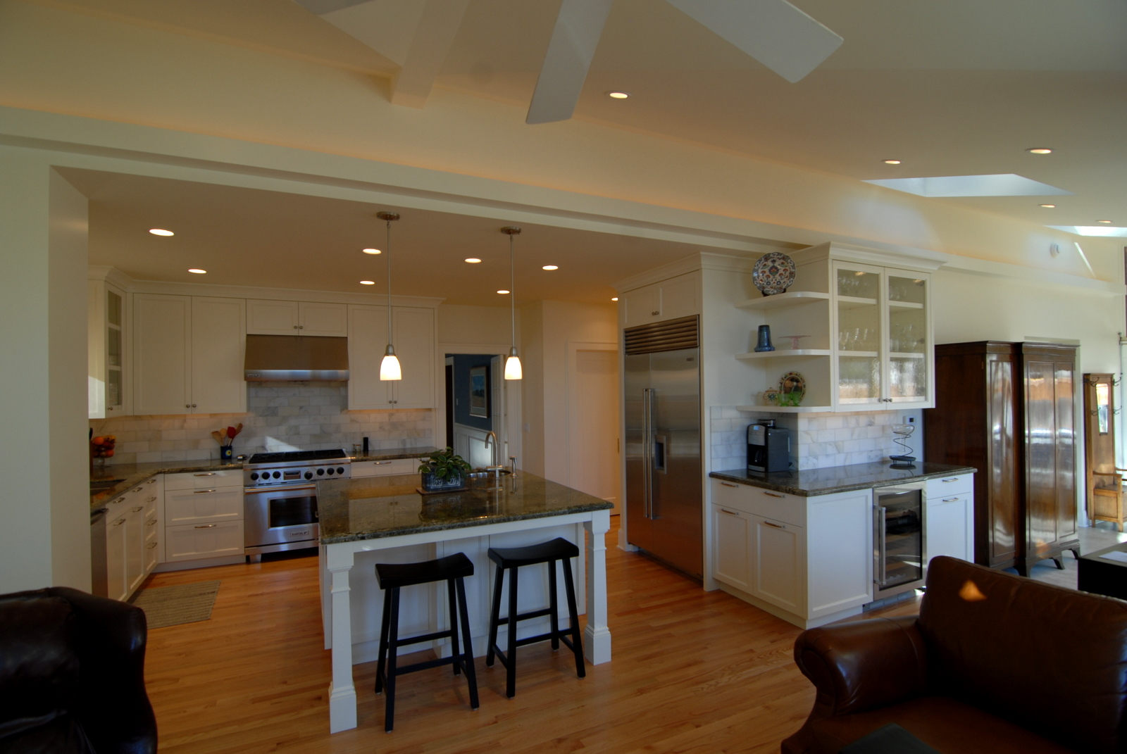
I love the mix of white cabinets, carrera marble and lagos blue limestone countertops, and the subway tile. And the tile floor really sets it all off. I have to give credit to my client for the floor, as I was worried it might be too busy but she pushed for it, and it looks fantastic!


