![]()
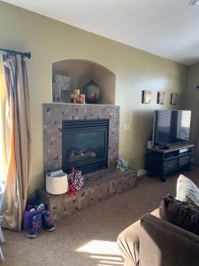
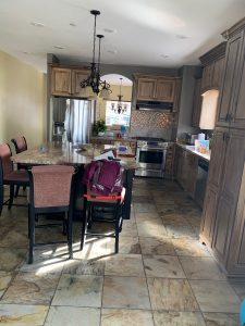
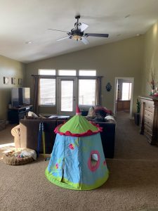
Needless to say, we jumped at the opportunity to be part of their main floor update. The ‘before’ pictures below illustrate the great potential of the space. A few modern cosmetic updates quickly enhanced the look and feel of these spaces.
What We Love Most About This Project:
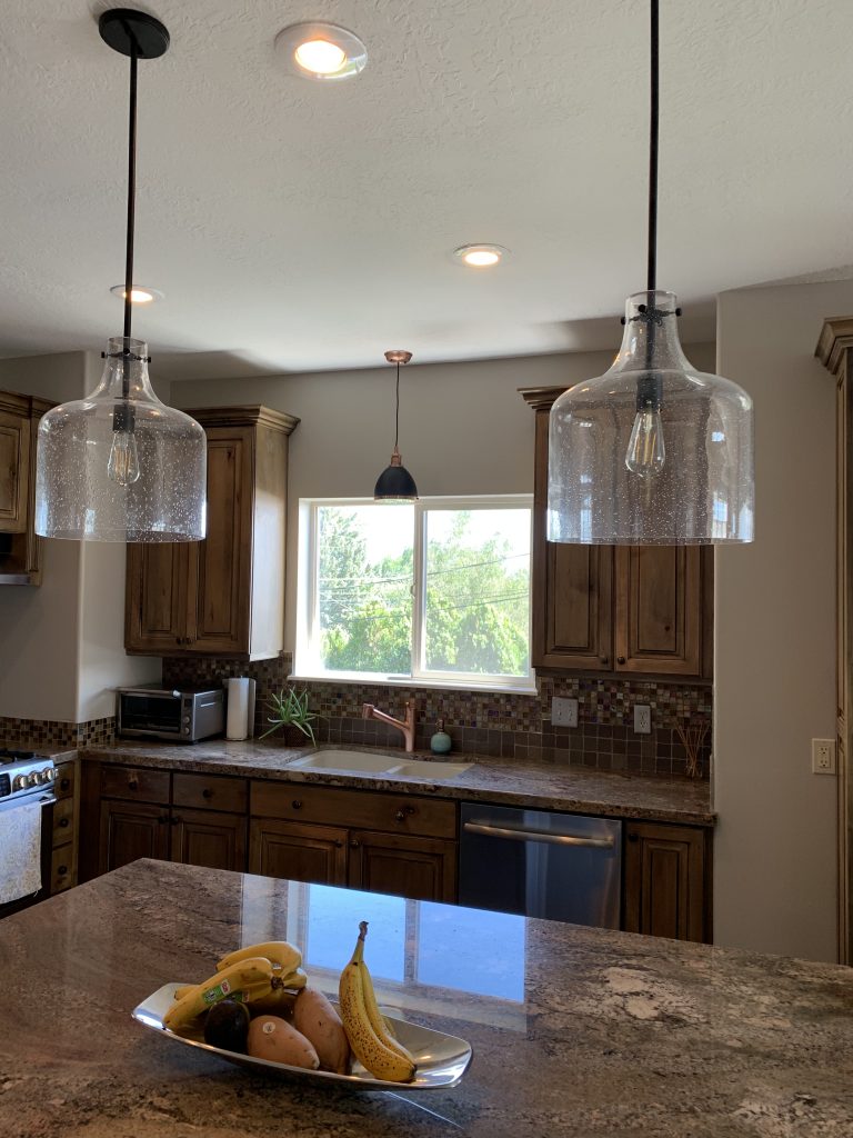
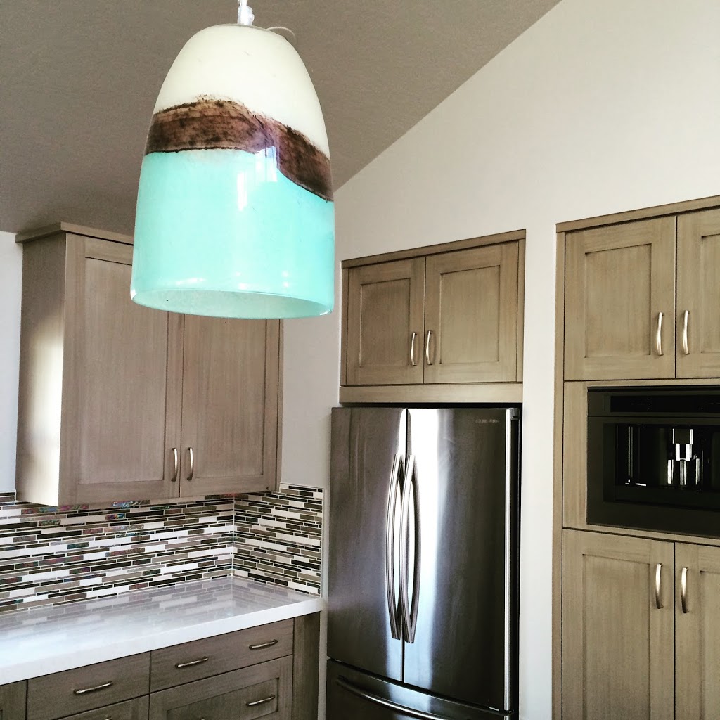
~ We removed a heavy wooden valance over the kitchen sink and replaced it with a decorative pendant. This instantly made the kitchen feel lighter and updated.
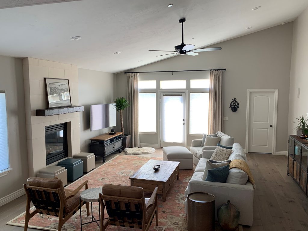
~ The flooring: adiós awkward carpet & tile mixture; hello wide-plank engineered maple!
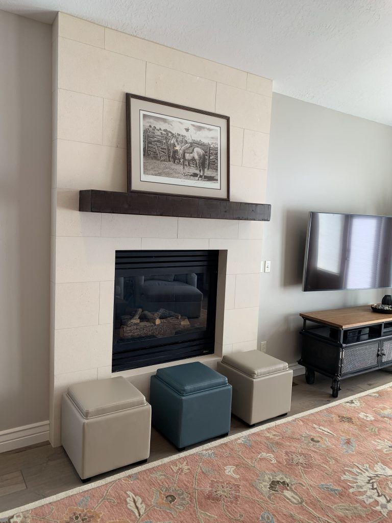
~The fireplace: we closed up the upper arch, eliminated the tile, and updated the entire look with a clean textured limestone tile and a rustic mantle.
~ The lighting: We replaced all the main floor lighting and fans with elements much better suited to the clients’ “mountain modern” tastes.
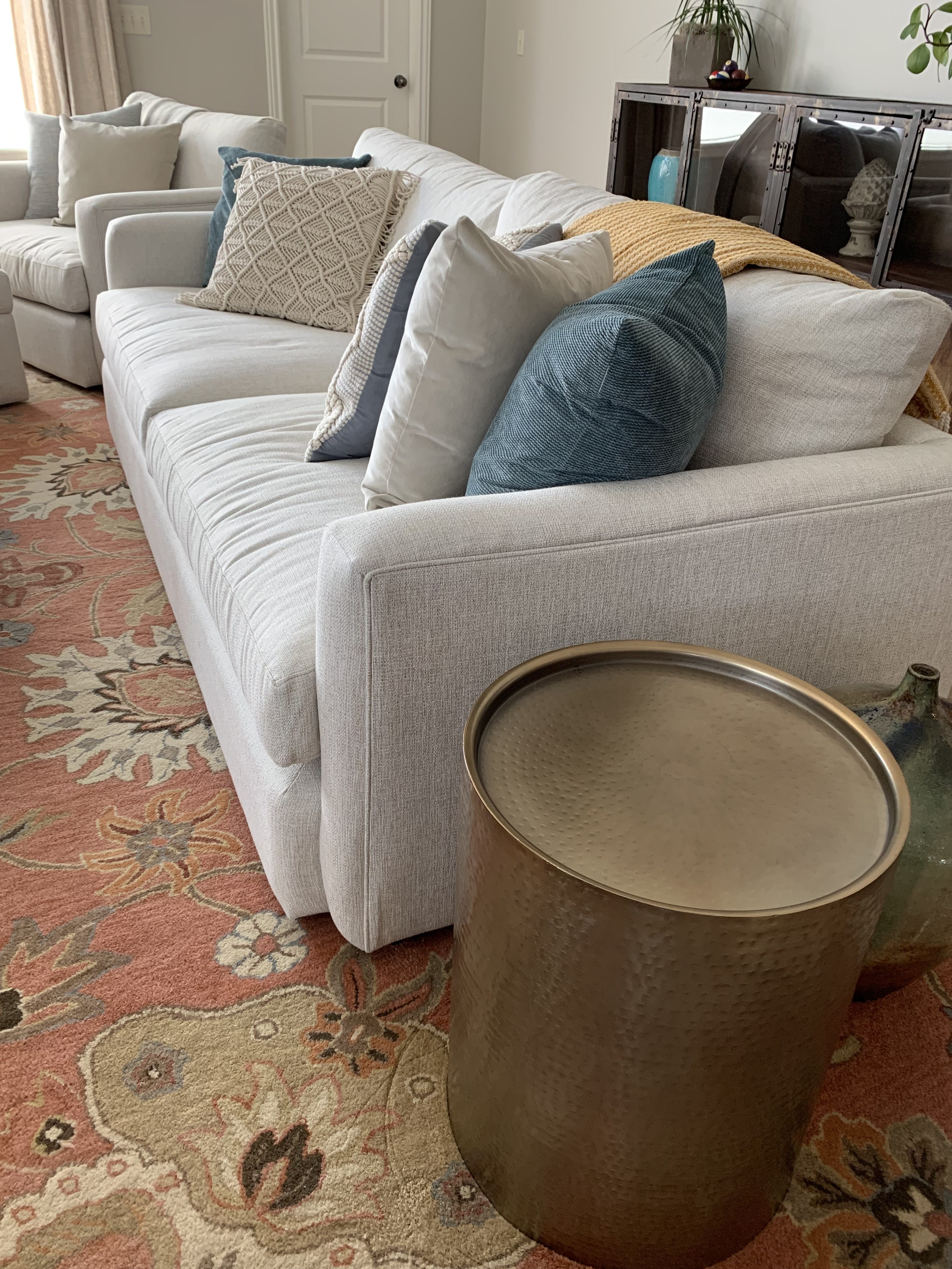
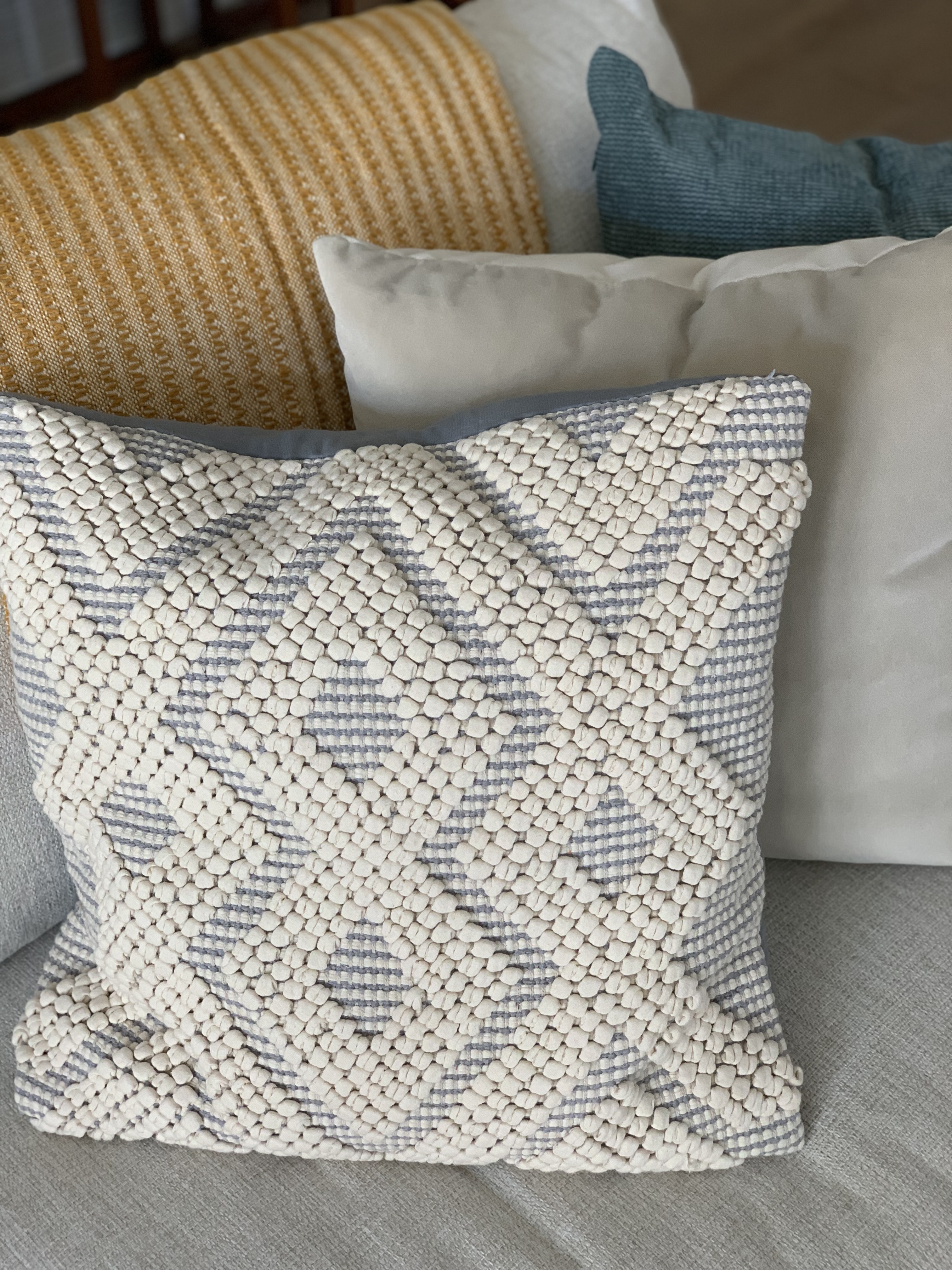
~ The furniture: We wanted comfortable yet modern pieces, so we used an extra-deep sofa & oversized chair, both covered in a lighter performance fabric (it’s bleachable!) to keep the furniture from feeling too heavy.
~ The window treatments: The original curtains came with the home. We replaced these with top-down-bottom-up light filtering shades, complemented by linen blackout drapery panels. (And, for the sake of budget, we were able to re-use the previous drapery rod, and we found pre-made panels so the client didn’t have to pay for custom drapery!)
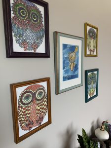
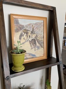
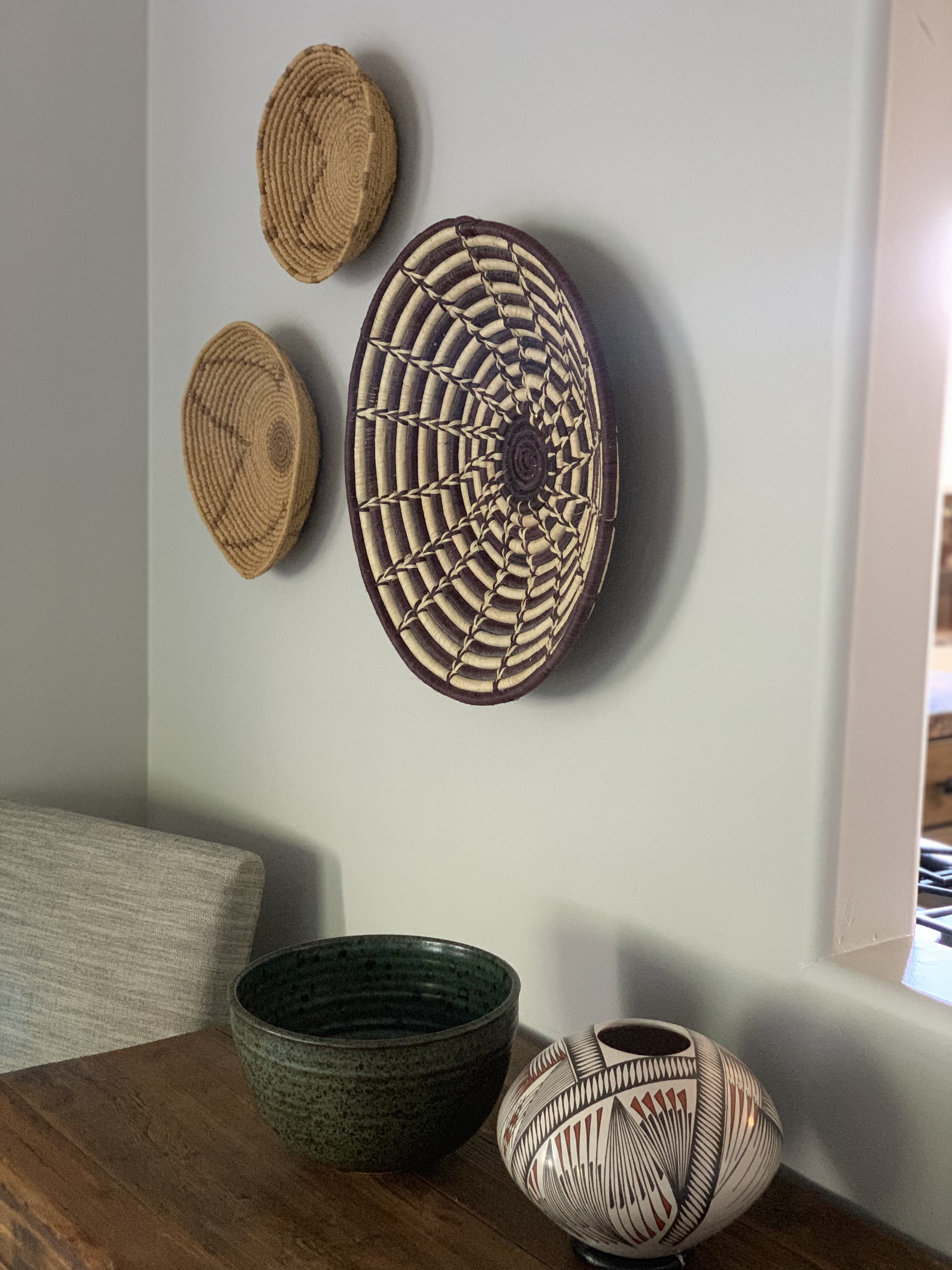
The final touch was incorporating the existing artwork back into the new space. Each piece of art holds a beautiful glimpse into their lives: art pieces from travels, their daughter’s artistic owl masterpiece, a hand-crafted Balinese sculpture of their dog, artwork created by family, grandmother’s baskets, and grandfather’s barometer. The personal details of the home shine a light on what our clients value, and we are so honored to help them create their best space. 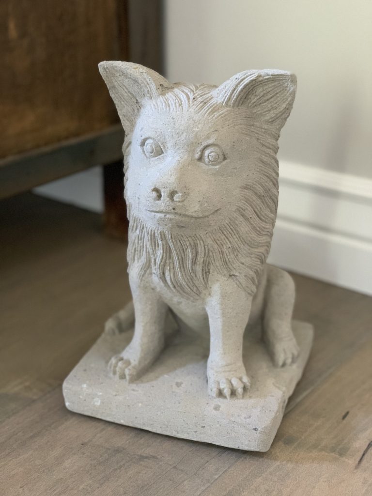

The icing on the cake for this project was surprising them with the fun textures we added through the use of pillows and other accessories. We were thrilled to have them come home from vacation to see (& love) the completed project!
As always, thank you to everyone who contributed to this project:
~ Flash Contracting (finish carpentry)
~ Vama Flooring (wood flooring & carpeting)
~ Pedro with CL Painting
~ Metro Tile (fireplace tile)
]]>
We love a good remodeling project, especially when the Before photos really show the dramatic change. This is the perfect Before & After project to showcase! We’re grateful that we have projects like this to add to our portfolio. On top of that, the clients are wonderful and fun people, so we really lucked out with this one!


We definitely have a wide variety of projects right now. Our projects include new builds, remodels, furnishings, and even a few commercial projects. Styles range from historic period styles to transitional to modern. And each project is challenging and exciting in its own way.

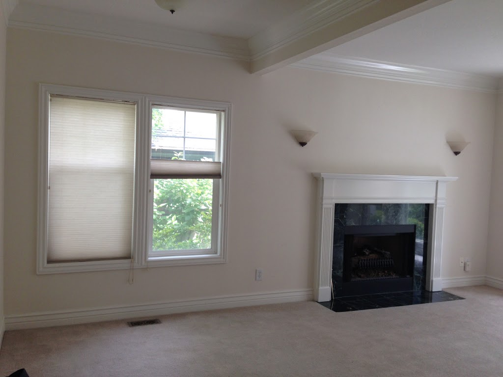
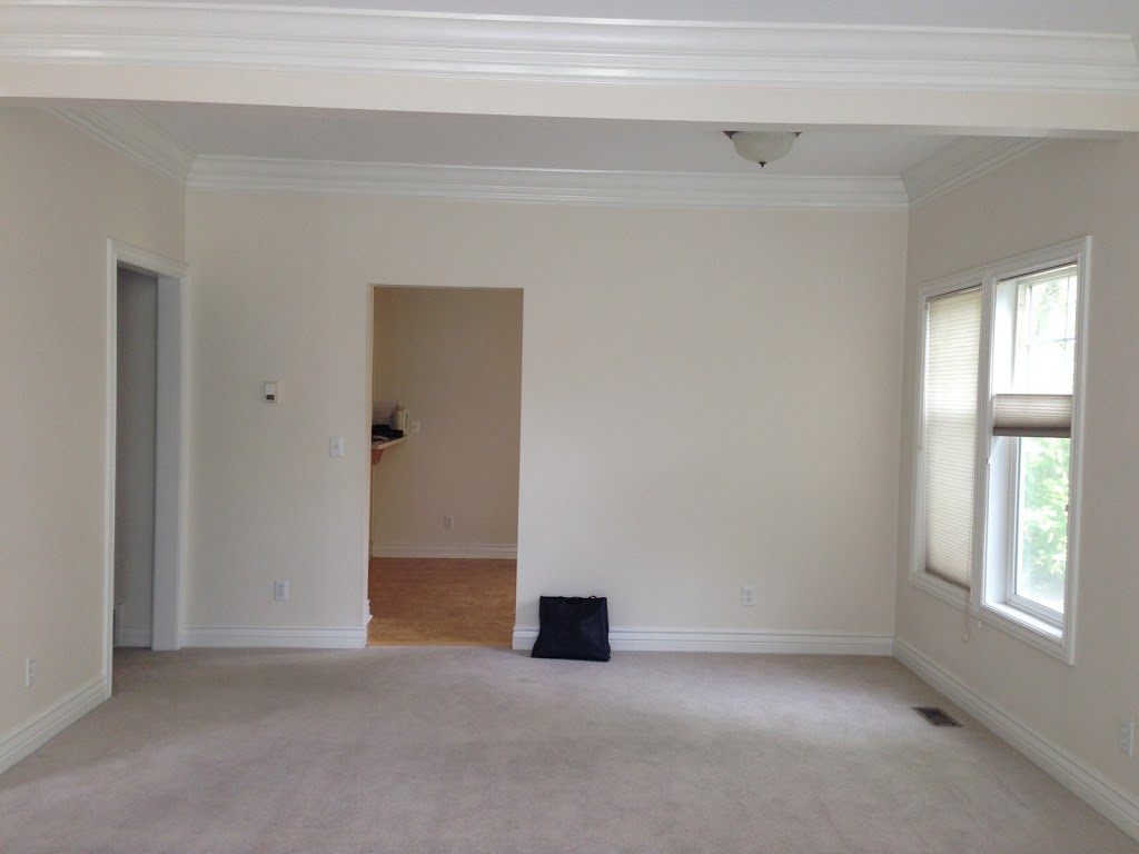
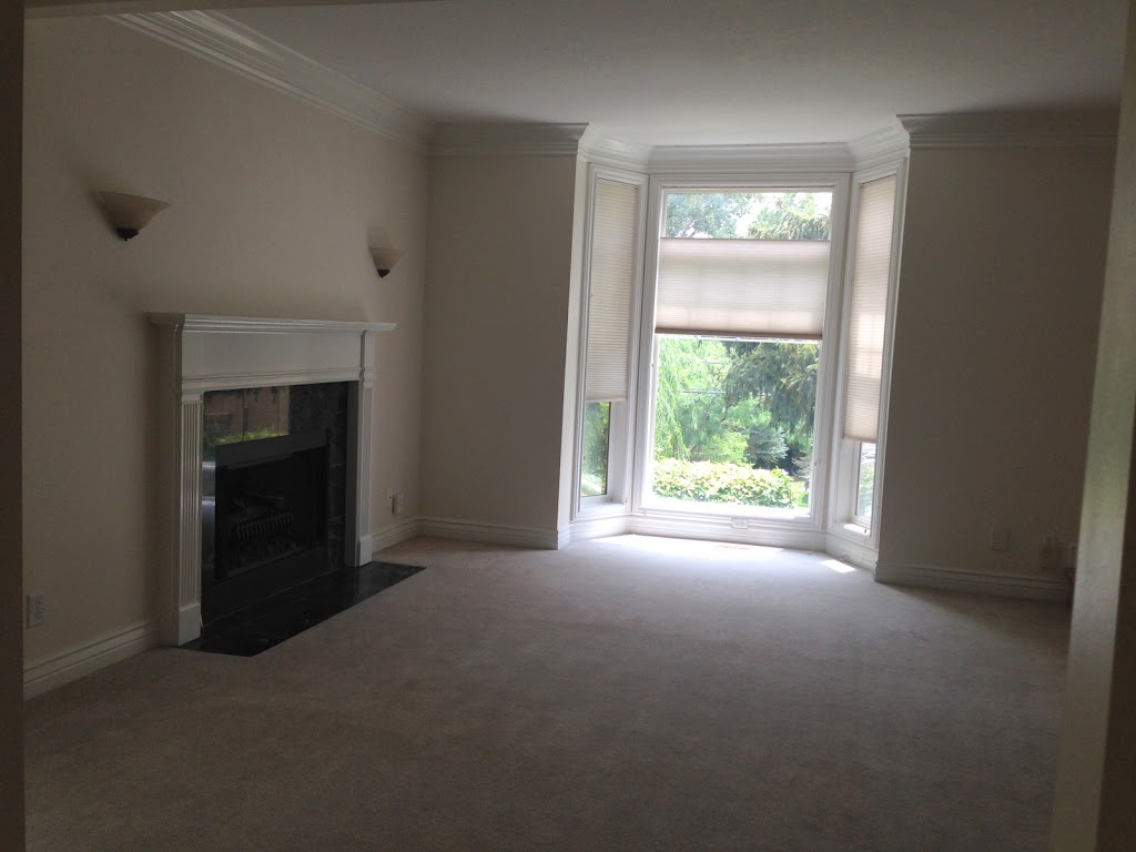
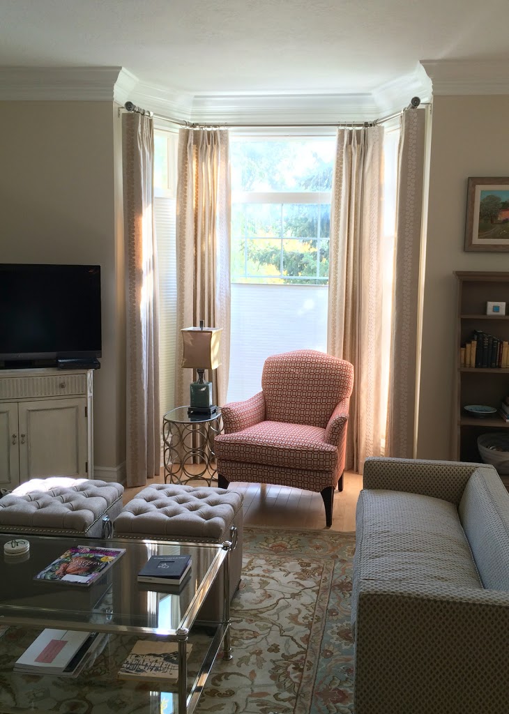
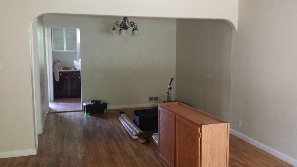
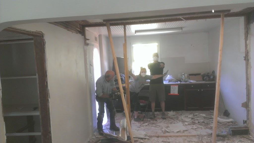
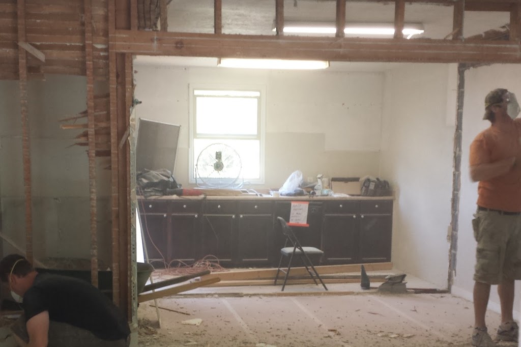
This particular client was moving into a new (empty) home with simple yet very traditional details, so we had a blank canvas to work with. While we did miscellaneous projects throughout the whole house, the main focus was the Living Room. We had to work with the existing fireplace and wall sconces (perhaps they will be part of Phase 2?), and the layout of the room was a bit challenging.
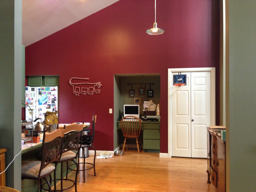
Here’s what it looked like before:
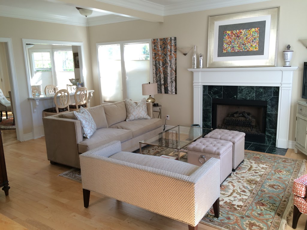
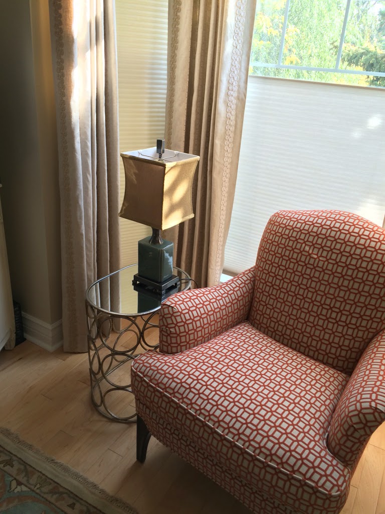
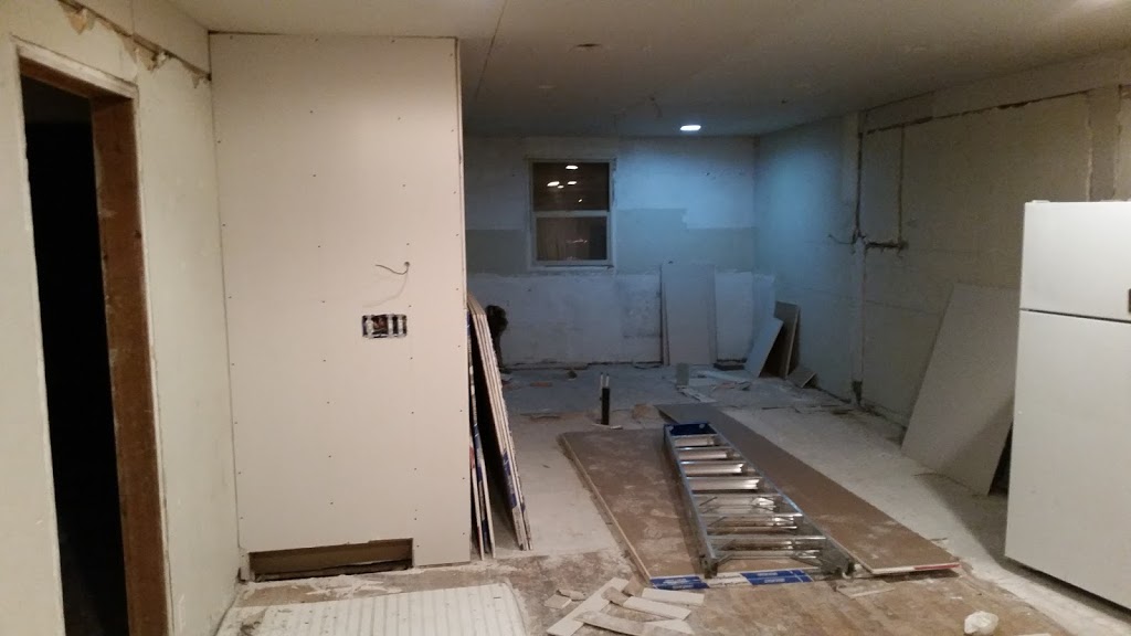
We painted, added hardwood floors, built a pass-through into the Kitchen, and furnished the space. We incorporated some of the client’s existing furniture (bookcase, bar stools, etc.) and they added the finishing touches from their own accessories and extensive art collection.
Before photo of the bay window:


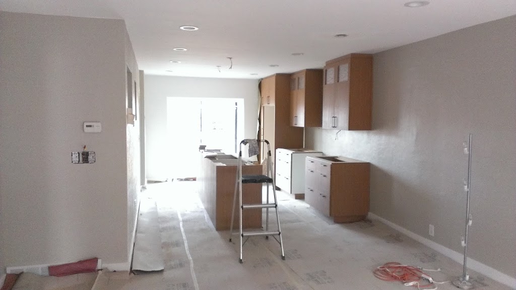
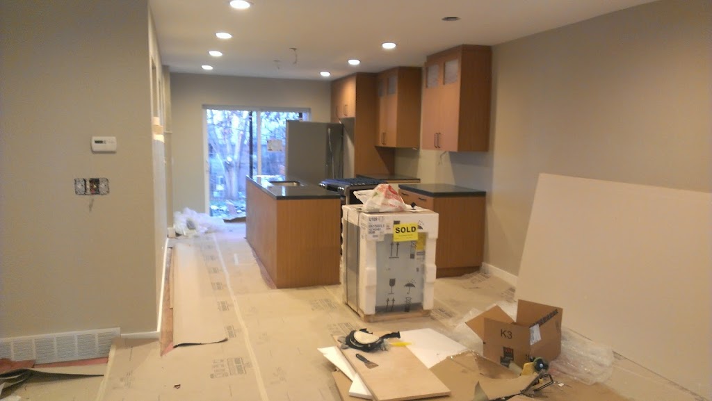
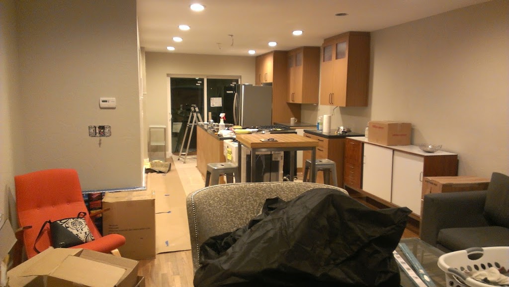
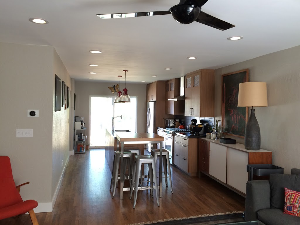

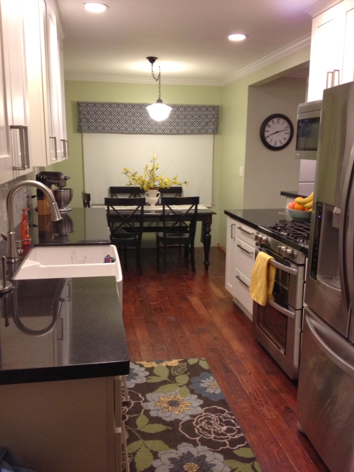
Last week I wrote about a recent kitchen remodel over on the Utah Style blog. Today I wanted to present some before & after photos for comparison.
The “before” photos of a remodeling project are what makes remodeling so unique compared to new construction. They indicate the challenges involved in the job, as well as the dramatic difference good design can make, both in aesthetic and (just as important) function.
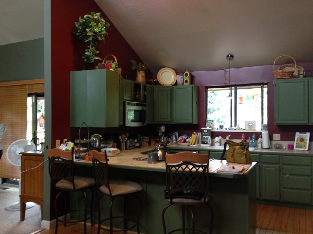
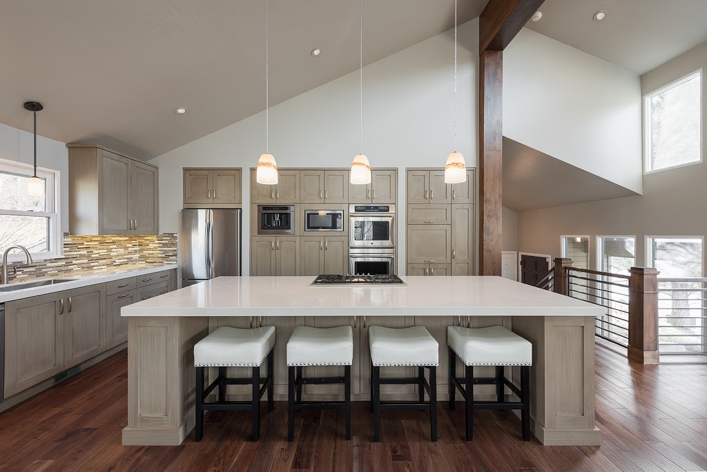
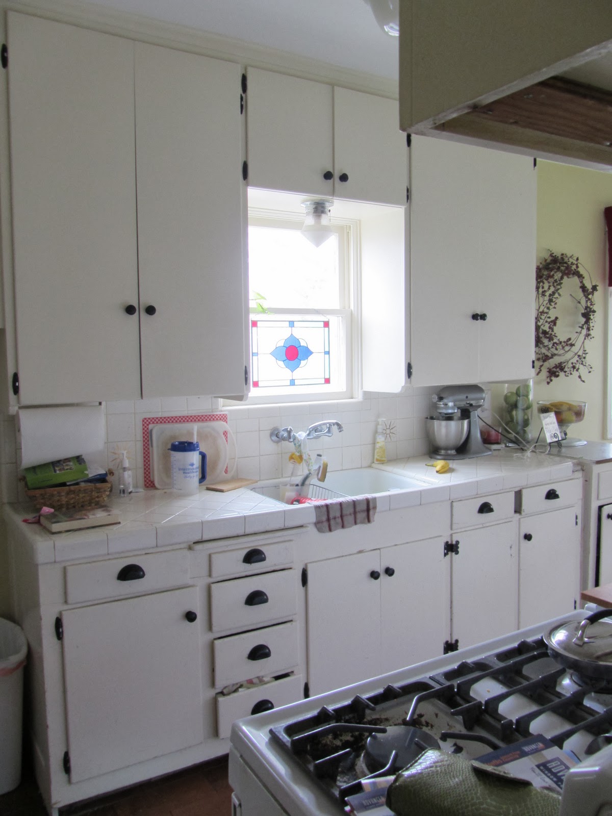
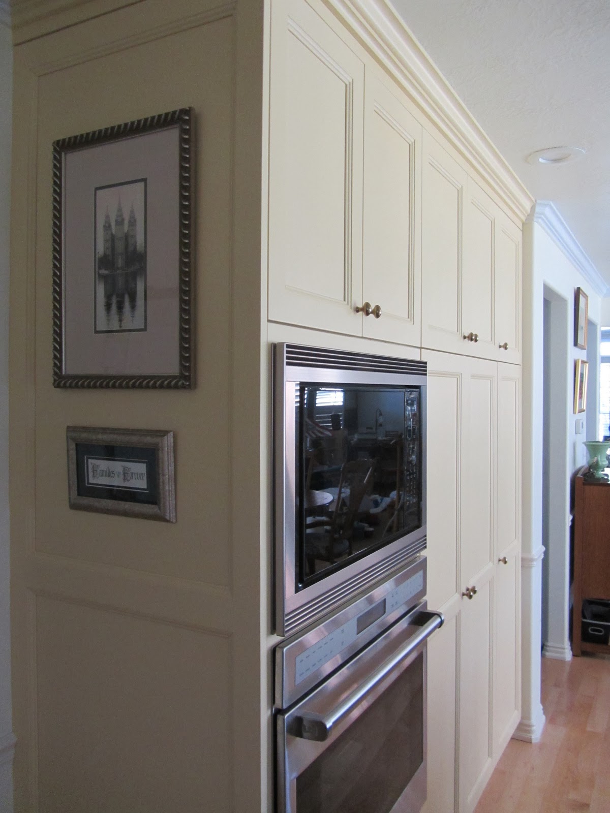
Let me give a little background on this project. The client was looking to update their oak kitchen so she called enzy design. During the course of our initial consultation I pointed out some of the inefficiencies of the kitchen layout, and we discussed potential changes. We explored these changes throughout the design phase – I presented a concept that combined the island and dining table, creating space for a casual sitting area in the kitchen. Fortunately the client was open to new ideas, and we went in this direction. Since photos speak louder than words, I’ll stop writing and just post some photos:
Before:
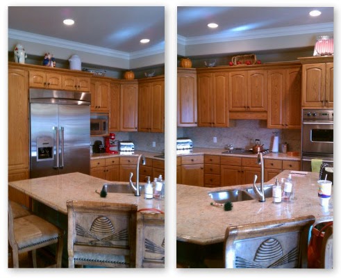
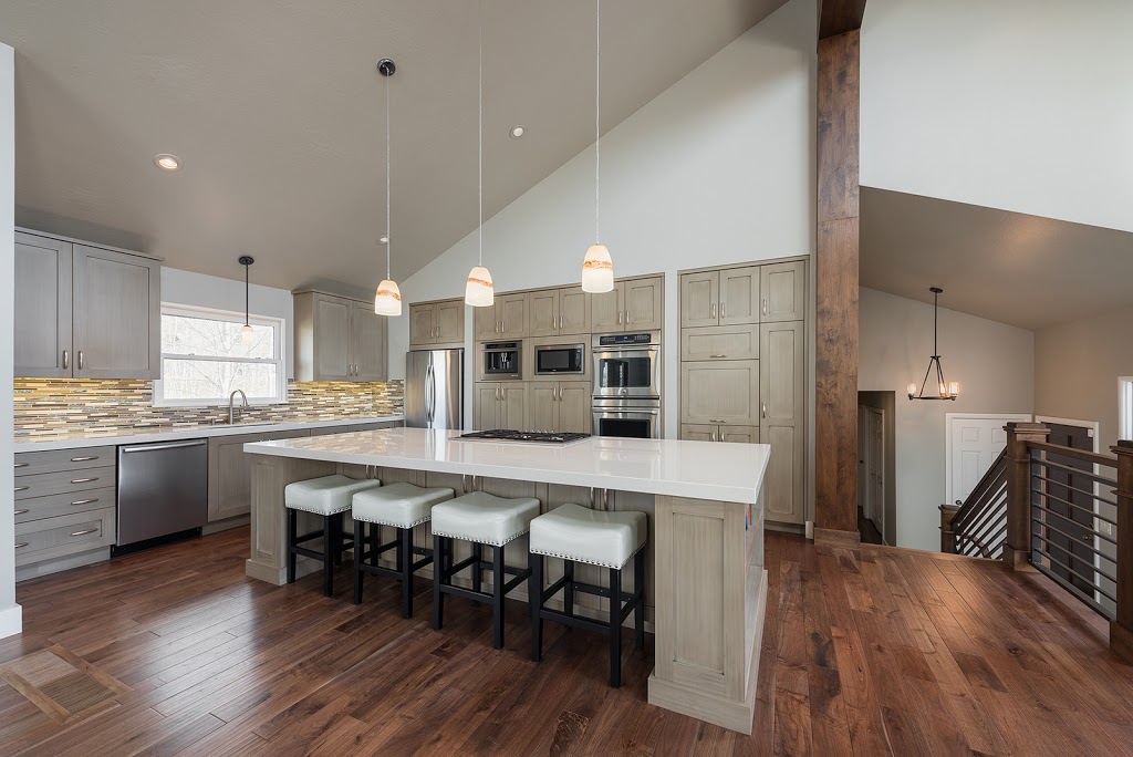
After:


We do a lot of full-service design work, where we handle the project from the very initial conceptual design phase through the completion of construction. However, sometimes the most critical (and difficult) part is developing the most functional plan for the space and the budget, and clients find that hiring a certified designer for this step is worth every penny.
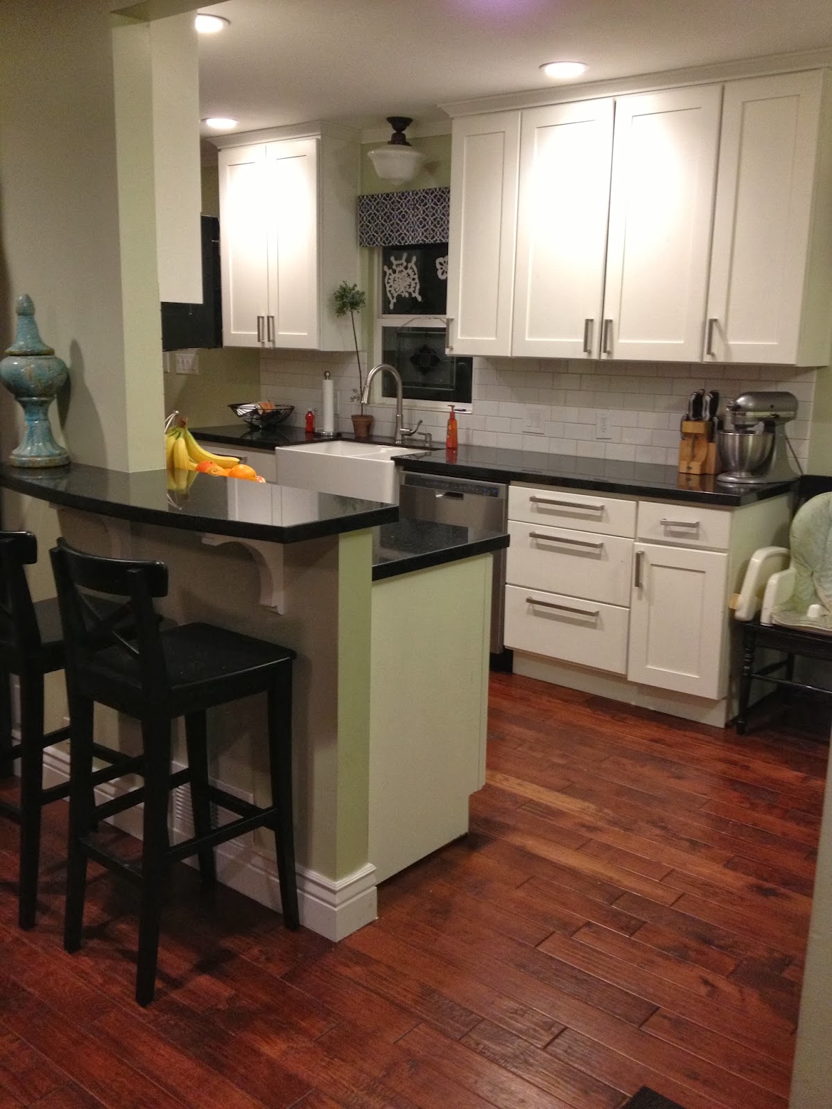
The existing kitchen was small; the cabinet layout was inefficient and it made the space feel even smaller. Though there was no room for expansion, this growing family needed a more open space. They had gotten a free design for the cabinet layout, which essentially just plugged cabinets into every available space. (I understand – I was much less inclined to take the time to be creative when I was designing for free.)
We spent a good amount of time talking to the client, discussing their needs, and measuring the space. We came up with a few options and chose the best plan to maximize function and open up the space. We provided the floor plan and elevations, and the client took it from there.
They recently sent me some after photos and I love the outcome. Kandise has a good eye for decorating, and it shows.
.jpg)
.jpg)


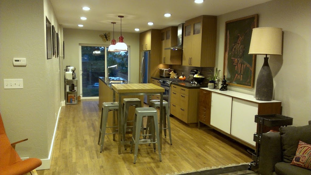
I’m excited to share this recent kitchen remodel!
Starting with the floor plans… the clients initially were interested in a “pull & replace” scenario (pulling existing items out and putting new back in the same spot). But because walk-in pantries are often not the best use of space, we convinced them to consider an alternative layout that reduced the pantry closet size. The outcome: a larger kitchen with more organized pantry storage and a bigger island.
Here’s the Before:


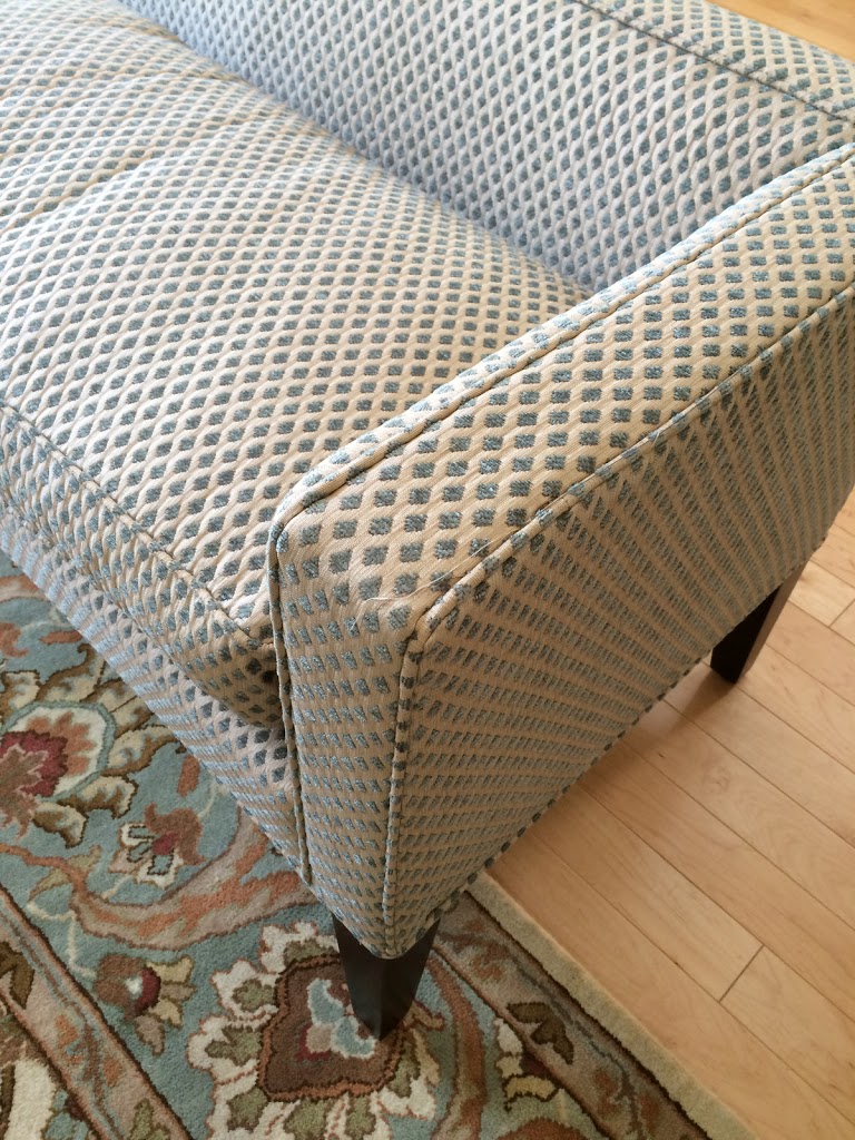
And the final finishing touch was the new upholstery fabric for their dining set. We found the perfect fabric from Robert Allen that coordinated with the colors and perfectly accentuated the lines of the dining chairs.


I thought I might add more photos from this charming remodel featured yesterday on the Utah Style blog.
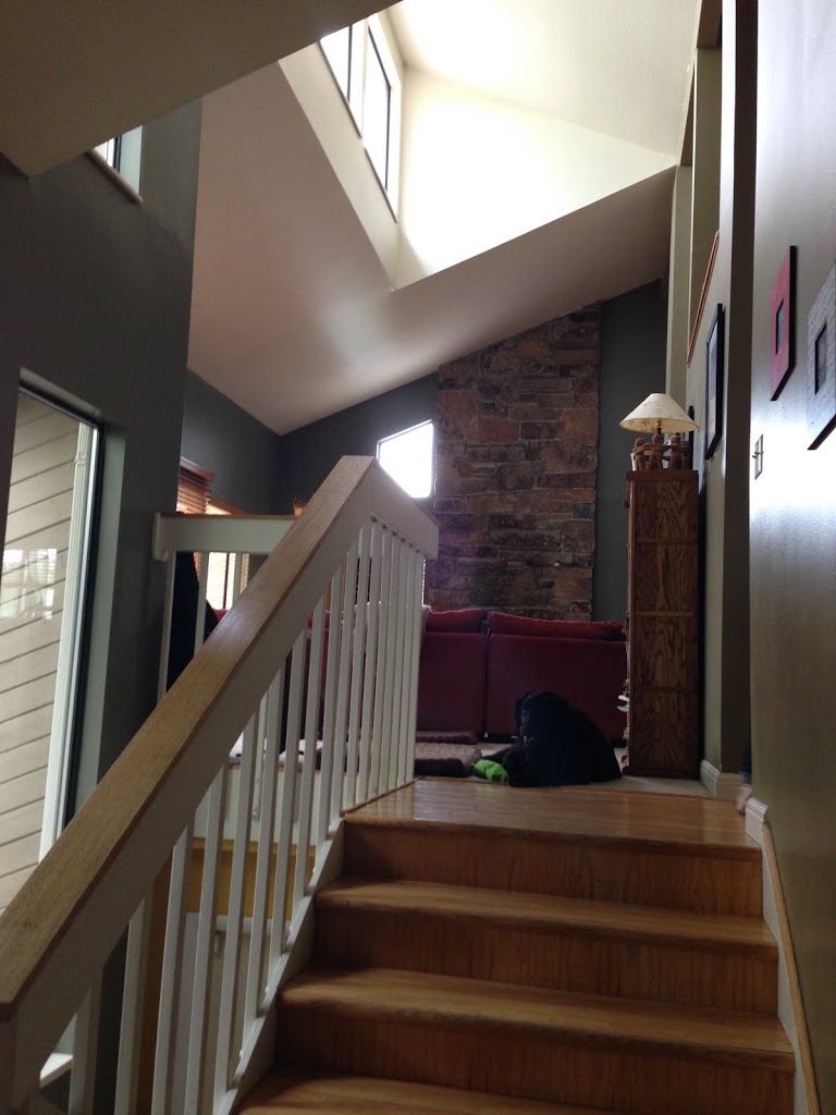
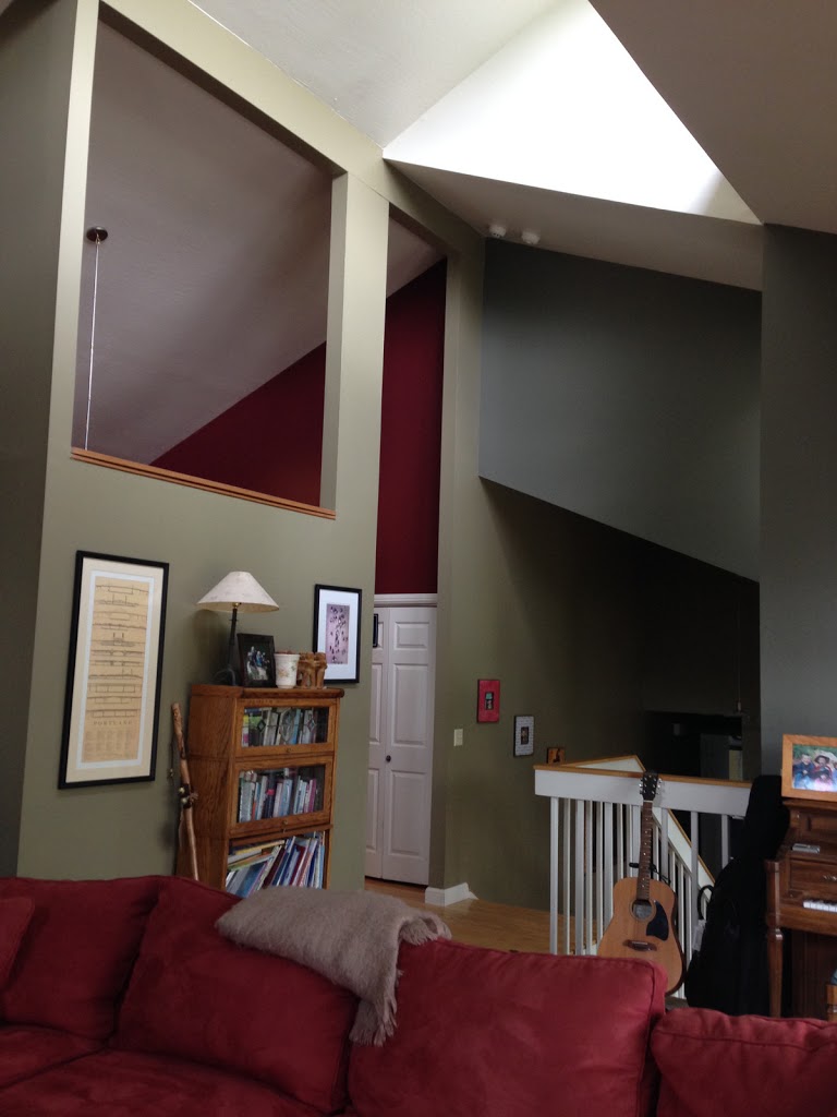
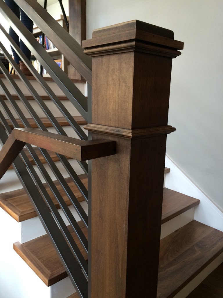
I mentioned this was a small space, so I thought I might elaborate on the space-planning challenge. The main part of this project involved the stairs. We redesigned and rebuilt the stairs (including the staircase to the basement) in order to gain more room on the upper level for the bedroom AND a new bathroom & closet, creating a private and cozy master suite.
Here’s the “before” floor plan – notice how the stairs chopped up the whole space:


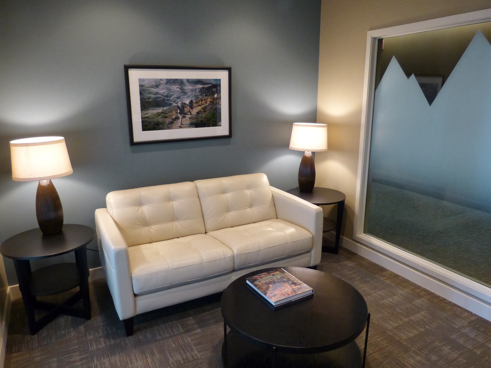
Twin Peaks Wealth Management would feel comfortable, so we divided the space into a private working office, with a separate waiting room that was intended to be warm and inviting.